How to Add a Screen Print Effect in Photoshop

How to add a screenprint effect to your image in photoshop. Hopefully by the end of this tutorial you will be able to make your own screen print poster.

Step 1> Create a Layer.

Step 2> Use a speckle brush and cover your image untill it looks faded.
how-to-add-screenprint-effect-ps-photoshop

Step3> Create another Layer, add more colored speckle (I used orange) & make the opacity 25%.
how-to-add-screen-print-effect

Step 4> Duplicate your image, move it to the side and down.

Step 5> Change the color and opacity to 40%.
how-to-add-speckle-in-photoshop

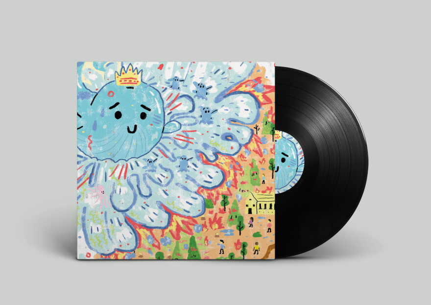
and the final image for myself:
screenprint

Artwork by Johnathan Taylor. For more illustration and design please visit my website over here —> jt’s website.

Daily drawing process

How did I make this image? I bet the curiosity is killing you.
Kitchener-Waterloo-Graphic-Design

Don’t worry, I will share my process.. Usually my illustrations will start as a sketch.
Waterloo-Graphic-Design

Then Colour!
Kitchener-Graphic-Design

And sometimes a little texture =
Kitchener-Waterloo-Graphic-Design

And there it is.. the process for this daily illustration! Sometimes it’s good to explore more colour schemes but since this was just for fun/practise I just rolled with the first colour schemed explored! For more Graphic Design and Illustration please visit my website here as well find me on twitter, behance, dribbble, or instagram.

5 Tips on How to Pick Color for Illustration and Design

5 Tips on How to choose color for your illustration or design project.

how-to-pick-color-for-illustration-and-design

Picking color for illustration and design can be a tricky task but is a powerful tool that should be studied, color can create interest, hierarchy, and harmony. In this blog I wanted to share a few tips I’ve learned when it comes to choosing colors for an illustration or design.

  1. Start in greyscale. You can nail down the tone in black and white and then pick your color using your HSB slider in adobe photoshop or adobe illustrator.


2. Take inspiration from real life. The natural world around you is a great place to get inspiration. Take photos, or download the Pantone app on your IOS and capture colour that way.

3. Use a minimal pallette. Don’t try and do too much if your just learning about color.

4. Try different combos. Sometimes it helps to create a few different colour combos to practise your colours for that image and too have options.


5. Look at other designs and illustrations. Studying other artist’s and designer’s work is a great way to learn about color. Or use the eyedropper tool and take color that way!

Thanks for reading, please find me on twitter to stay connected. or visit my website here.